Denmark’s Indoor Climate Code Rewrites a Municipal GIS Team’s Data Model
In late 2024, Denmark’s building code quietly added a requirement that would break a municipal GIS team’s data model. The new indoor climate provisions demand continuous monitoring of temperature, humidity, and CO₂ in public buildings, with data that must be accessible to inspectors on the move. For the team responsible for the city’s spatial data, this meant their carefully curated polygons and floor plans were no longer enough. The model that had served static maps for decades couldn’t represent a building’s breath.
Why a Municipal GIS Team Had to Think Like a Mobile Shop
Municipal GIS teams are used to thinking in layers: parcels, zoning, flood zones, building footprints. Their data models are built for desktop viewers and annual updates. But the indoor climate code changed the game. Suddenly, the primary interface for field inspectors is a tablet or phone, not a workstation. These inspectors need to pull up a building’s sensor readings while standing in a stairwell, often in a basement with spotty connectivity.
The tension is immediate. Desktop workflows assume a stable network, a large screen, and a mouse. Pocket-sized reality means a 6-inch touchscreen, intermittent signal, and a user who is juggling a clipboard and a flashlight. The GIS team’s first instinct was to build a mobile viewer that wrapped around the existing desktop model. That failed within weeks. The data model itself was the bottleneck.
“We kept trying to bolt a mobile interface onto a model that was designed for static queries,” says one developer on the project, who asked not to be named because they weren’t authorized to speak publicly. “Every screen refresh required a full polygon fetch. On a good connection, that was fine. In a concrete stairwell, it was a spinning wheel.”
The code’s requirements are specific: sensors must log at intervals, and readings must be correlated with locations. That means the data model needs to represent both space and time. The legacy model had no concept of a time-series stream. It was like asking a cartographer to draw a weather map using only a land survey.
The team’s realization was blunt: they weren’t just building a mobile app. They were becoming a mobile shop, with all the attendant concerns about offline sync, battery life, and small-screen UX. And that meant the data model had to be redesigned from the ground up, not patched.
The Data Model That Couldn’t Handle a Building’s Breath
The original schema was typical for municipal GIS: a set of polygons representing building footprints, with attributes like address, construction year, and permitted use. Floors were separate polygons, and rooms were sometimes annotated as points or areas. The model was static. It captured what a building was, not what it was doing.
The indoor climate code demands continuous monitoring. Sensors are placed in rooms, corridors, and ventilation shafts. Each sensor produces a stream of readings, timestamped and varying over time. The existing model had no way to represent a sensor, let alone a time-series. You could store a current temperature as an attribute, but that’s like taking a single photograph of a river and calling it the river.
“The model was built for a snapshot,” explains a data architect who consulted on the rewrite. “It could tell you that a room existed, but not that it was getting stuffy at 3 PM.” The mismatch between spatial and temporal data was the core problem. The team needed to join a building’s geometry with sensor streams, and their relational database wasn’t built for that.
They tried workarounds. They added a “sensor” table with a foreign key to the room polygon. They created a separate table for readings, each with a timestamp and a value. But queries that needed to join geometry and time were slow, and the model didn’t capture airflow or adjacency. A room’s temperature isn’t just about that room; it’s about the rooms around it, the corridor, the ventilation shaft.
The breaking point came during a pilot test in a school. Inspectors needed to see a corridor’s CO₂ trend over the day to understand why a classroom was stuffy. The query required joining four tables, computing a spatial buffer, and then doing a time-window aggregation. It took over 40 seconds on the production database. The team knew they had to start over.
This experience was not unique. Across the Nordic region, municipalities are grappling with similar mandates. In a neighboring city, a team tried to extend their existing relational schema with time-series extensions. They ended up with a database that was so slow that inspectors simply stopped using the app. Their lesson was that incremental patches to a fundamentally static model rarely work. The Danish team’s decision to rebuild, painful as it was, proved more sustainable in the long run.
Rewriting the Model: From Static Polygons to Living Graphs
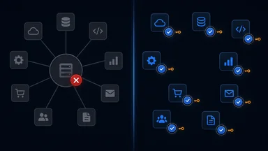
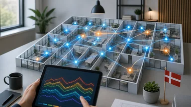
The team’s solution was to shift from a purely relational model to a graph-based structure. In this model, spaces are nodes: rooms, corridors, stairwells, and even building zones. Edges represent adjacency, connectivity, and flow. A sensor is a node attached to a space, and its readings are stored as time-series data in a separate store, linked via references.
This graph structure allows for queries that the old model couldn’t dream of. To find out why a room is warm, you can traverse the graph to see which adjacent spaces have high sensor readings, and which ventilation paths are blocked. The model treats airflow as a first-class citizen, not an afterthought.
Versioning was another critical piece. The team adopted a schema versioning approach, where each change to the model is backward-compatible. Old queries still work, but new queries can use the richer graph. This was essential because the municipal GIS data is used by other departments, and they couldn’t just break their integrations.
Time-series data is stored separately, in a dedicated time-series database, and linked to the graph via references. This separation means that the graph doesn’t get bloated with millions of readings. Queries can pull the latest value quickly, and deep analysis can hit the time-series store directly.
The transition wasn’t easy. The team had to write migration scripts to convert existing polygons into graph nodes and edges. They had to validate that the graph accurately represented the physical building. And they had to train their team on a new query language. But the payoff was immediate: the school pilot that took 40 seconds now returned in under a second.
However, the graph model is not without its own trade-offs. Graph databases are excellent at traversing relationships, but they can be less efficient for large-scale aggregations. For instance, generating a city-wide report on average CO₂ levels across all schools would be simpler in a relational model. The team mitigated this by keeping a denormalized summary table in the relational database, updated periodically from the time-series store. This hybrid approach—graph for operational queries, relational for reporting—gave them the best of both worlds without overloading either system.
The Mobile App That Forced the Architectural Shift
The mobile app was the catalyst for the entire rewrite. Field inspectors now use tablets and phones to view sensor data, log inspection results, and update building information. The app had to be offline-first, because connectivity in basements and stairwells is unreliable. That meant caching entire building graphs on the device.
Offline-first is a discipline. The team designed the app to download a building’s graph and sensor data before the inspector enters the building. The cache is stored locally, and the app operates entirely against that cache. When the inspector finishes and has connectivity, the app syncs changes back to the server.
Sync conflicts were a major headache. Two inspectors might update the same room’s attributes simultaneously. The team solved this with per-node timestamps: each node in the graph has a last-modified timestamp, and conflict resolution uses a last-write-wins strategy. It’s not perfect, but it’s predictable, and it’s what the inspectors wanted.
The cross-platform framework choice was React Native. The team had a mix of iOS and Android devices in the field, and they didn’t want to maintain two codebases. React Native allowed them to share most of the logic, and they wrote native modules for Bluetooth sensor polling, which is used to read sensors that don’t have network connectivity.
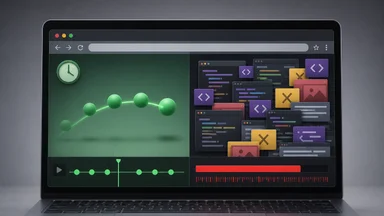
The app’s UI is deliberately simple. Inspectors see a list of buildings, then a floor plan, then a room. Tapping a room shows current sensor readings and a graph of recent trends. The entire flow is designed to be usable with one hand, with large touch targets and minimal text entry. The team learned that a mobile app isn’t a desktop app shrunk down; it’s a different animal.
One of the more subtle challenges was dealing with the variety of sensor hardware. The team initially assumed that all sensors would report via Wi-Fi or cellular, but they quickly discovered that many older buildings had sensors that only communicated over Bluetooth Low Energy (BLE). This meant the app had to poll sensors directly, which introduced issues with battery drain and signal range. They addressed this by implementing a background polling mechanism that only activated when the inspector was within range, and by using a battery-efficient BLE protocol. The team also had to handle sensor failures gracefully—if a sensor went offline, the app would show a warning but still allow the inspector to proceed, logging the issue for later maintenance.
Performance Lessons from a 200-Megabyte Building Model
One of the first performance issues was the sheer size of the building graph. A large school complex, with every room, corridor, and sensor, could serialize to over 200 megabytes. Downloading that to a device was slow, and loading it into memory caused older devices to choke. Initial load times exceeded 30 seconds on some tablets.
The team’s first optimization was lazy loading. Instead of downloading the entire building graph, the app downloads only the floor plan and sensor data for the floor the inspector is currently on. As the inspector moves to another floor, that floor’s data is fetched on demand. This cut the initial download to a few megabytes.
They also compressed the graph serialization format. By using a binary format instead of JSON, and by deduplicating repeated strings like room names and sensor types, they cut the size by about 60%. The 200-megabyte model became roughly 80 megabytes, and with lazy loading, the per-floor payload was often under a megabyte.
Background prefetching was another win. The app predicts which floors the inspector is likely to visit next, based on the building’s layout and the inspector’s history. It prefetches those floors’ data during idle moments, so when the inspector walks up the stairs, the data is already there.
The target was under 2 seconds to first interactive view. After these optimizations, the team achieved it on most devices. The lesson was that performance isn’t just about code; it’s about the data model. A graph that’s designed for efficient traversal and serialization makes a huge difference.
But even with these optimizations, the team encountered a surprising bottleneck: the time-series store. While the graph could be loaded quickly, displaying a 24-hour trend for a single sensor required querying the time-series database, which was not optimized for mobile network latency. They solved this by pre-aggregating the data on the server and storing hourly summaries on the device. This meant that the initial view showed a coarse trend immediately, with finer granularity fetched on demand. This two-tier approach balanced responsiveness with data freshness, and it’s a pattern that any team dealing with time-series data on mobile should consider.
What Other Municipal Teams Can Steal From This Pivot
The most important takeaway is to start with a thin mobile client, not a full GIS desktop. Too many teams try to replicate the desktop experience on a phone. Instead, design the mobile app around a specific task, like “check sensor readings in this building,” and let that task drive the data model.
Design the data model to serve the app’s needs first. In this case, the graph-based model emerged from the need to query airflow and adjacency. If the app needs to answer a question, the model should make that question easy. Don’t force the app to bend to a model that was designed for a different purpose.
Treat sensor data as first-class, not an afterthought. The old model treated sensor readings as just another attribute. The new model treats them as a core entity, with its own lifecycle. This is a mindset shift, but it’s essential for any organization dealing with IoT or continuous monitoring.
Plan for offline usage from day one. Even if you think your field workers will always have connectivity, they won’t. Elevators, stairwells, and rural areas are all dead zones. Design your app to work entirely offline, and sync when possible. This forces you to think about cache invalidation and conflict resolution early.
Budget for schema versioning and migration tooling. The rewrite was painful because the old model was rigid. If the team had anticipated change, they could have built versioning in from the start. As it was, they spent months on migration scripts. Future teams will thank you if you build for evolution.
Consider a hybrid data architecture. As we saw, a graph database excels at relationship-heavy queries, but relational databases are still better for certain reporting tasks. Don’t be afraid to use both, with a clear boundary between them. This might sound like over-engineering, but for municipal systems that will be in service for decades, the flexibility is worth the initial complexity.
Finally, expect the unexpected in the field. Sensor hardware will fail, connectivity will drop, and inspectors will find new ways to use the app that you never anticipated. Build in graceful degradation paths and log everything. The team’s decision to log sensor failures and sync issues gave them a treasure trove of data for improving both the app and the data model.
The indoor climate code is just one example of how regulations can force technical innovation. The GIS team didn’t just comply; they rebuilt their entire approach. And while the process was painful, the result is a data model that’s more flexible, more responsive, and better suited to the real world. Other municipalities facing similar mandates should take note: your data model is not a monument. It’s a living thing.